Evaluations
Design#1 Business Flyer:
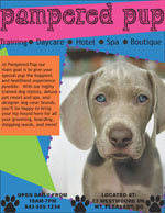
I created the flyer for a doggie day care business I came up with called Pampered Pup. I really like the way the flyer turned out. I chose to use an assortment of bright colors to catch the reader’s eye. The heading, “pampered pup” is done in a decorative font, but I used more common sans serif fonts for the other text so that the heading would be the only decorative font and would be the thing your eye is first drawn to. I placed a hot pink rectangle behind the heading to make it pop and stand out more. Underneath the heading, I listed some of the various services available at the organization and I separated each service with a small circle that resembles a bullet point. The list of services serves almost as a border separated the heading and the rest of the flyer. I played around a lot with angling different shapes around the flyer to give it depth and dynamic. I decided to use only one image, but I made it fairly large and applied a dotted stroke around it to add another creative aspect. I think the way I used only one image gives the flyer a more clean and organized look. I used dog paw clip art to create a border at the bottom of the page and also to highlight the contact information. I added a text box with a catchy marketing phrase to attract the reader and also give them a little more information about the organization. Overall, I think I created an attractive and effective flyer that utilizes various design elements I have learned from this course.
Design#2 Music CD Cover:
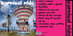
I created a somewhat simple design for my CD cover. I chose just to put a single image of the cover with the name of the band at the top in a decorative font. I think by doing this, the name of the band on the cover really stands out. Despite the simplicity of the design I think the image is unique and eye-catching. For the back cover, I drew one of the colors out of the image on the front and created a rectangle and filled it with that cover. I stuck with the same font as the title on the front for the rest of the design. I put the band name vertically on the right side on the back cover and applied a simple stroke around the text box. The bar code, copyright, and producer name are all very simply placed at the bottom of the back cover.
Design#3 Advertisement:
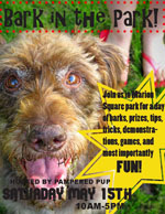
I made an advertisement for an event hosted by the same organization I created for my business flyer. I chose to use one main image for the entire background of the event. I felt like this image was coherent with the theme of the advertisement, “Bark in the Park.” I used the pen tool to draw a pointy cornered shape and applied a stroke to it. I used the shape as a text box for the information about the event to be written on. I used several different decorative fonts, but all in black ink. I put a red dotted stroke around the main heading that brought out the color of the flip-flops on the feet in the top right corner of the advertisement. I made sure the date of the event was very large and easy to read.
Design#4 Company Logo:
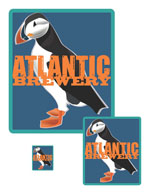
I made a somewhat simple, yet visually appealing logo for Atlantic Brewery. I started out with a rounded rectangle with a stroke around it. While searching for atlantic themed images to use I discovered that the Puffin is a very common bird in the Atlantic area. I then found an attractive picture of a cartoon Puffin to place inside the rounded rectangle. I placed the name attractively across the center of the logo in an orange color matching the Puffin’s beak and feet. I used a different font for each word, but they are both fairly simple fonts.